
Packaging Design for a line of Risotti which are the result of a collaboration between Pur Südtirol and a local farm named Höllerhof.
The line currently consists of two Mixes: A Vegetable-Risotto Mix, and a Pumpkin-Risotto Mix.
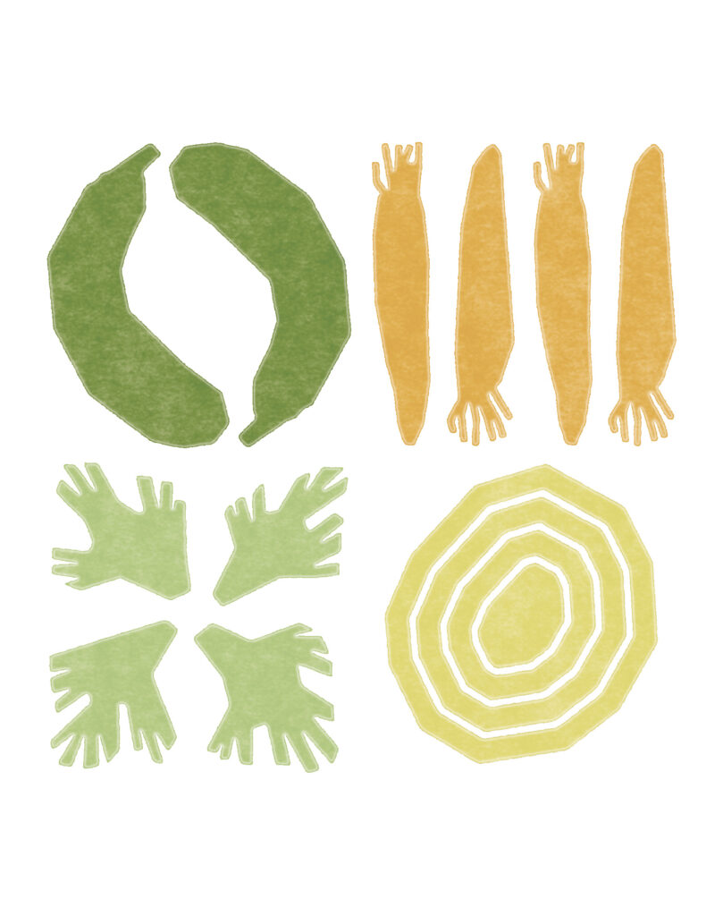
The graphic language is colorful, textured and friendly. It communicates the small scale production of the product by imitating the behavior of potato stamps.


Making potato stamps is a very childlike activity. The potatoes are halved, and then carved with a motive to be used as stamps. The results of this artistic technique are often quite rough and geometric in shape.
Aesthetically it conveys a feeling of familiarity and of things homemade. And so it is perfect for communicating the background and personality of a product coming from a small farm.
The stylized illustrations on the packagings represent the main taste-giving ingredients of the risotto.
The colors of the ingredients are visible through the plastic packaging. This automatically creates a harmonic color combination between the visible ingredients and the corresponding colors of the illustration.

In the longterm this organic development of color combinations will lead to a line of easily distinguishable risotto tastes, that are still clearly of the same line.
The simplified, geometric illustration style and natural colors build a clear and strong visual identity.